Turning Trends into Traffic
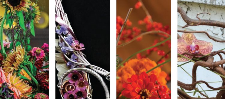
 On January 23, FTD University hosted “Turning Trends into Traffic.” This free webinar was presented by FTD Education Consultant J. Keith White AIFD. Keith served as the Creative Director of “The American Floral Trends Forecast 2018-2019,” which was published in the January 2018 edition of Florists’ Review. [View Report]
During the webinar, Keith broke down each of the four trends included in the forecast and provided thoughtful tips for utilizing them for both shop displays and design work.
We’ve summarized the highlights of Keith’s presentation below and included the video if you’d like to view the webinar in its entirety.
Capturing the trends
To identify the four trends featured in the forecast, a team of eight floral industry consultants studied forces such as interior design, fashion, textiles, social issues and movements, pop culture, entertainment, prominent floral designers and more. These factors can all influence consumers’ purchasing behaviors.
For the four trends, we have listed the relevant Design Master colors, elements and flowers.
Trend 1: Hanami
Hanami is Japanese for “flower viewing” and specifically refers to enjoying the transient beauty of flowers such as cherry.
 The colors: The two dominant colors are Peony and Carnation Red. The accent colors are Hunter Green, Maroon, Coral and Pacific Blue.
The elements: Jeweled accents, celadon vessels, vintage brocade, Japanese motifs, gold and champagne tones, blooming branches
Translation: Blue vessels, dark green foliage, detailed elements, blooming branches, champagne and gold overlays. As a representative of Keith also incorporated this trend into the flowers that adorned the vintage car that carried 2018 Rose Parade Grand Marshal Gary Sinise.
Flowers: Peony, oriental lily, garden roses, stock, dahlia, pincushion, smokebush, Japanese yew, cherry blossoms, willow eucalyptus. Keith encouraged attendees to look into the seasonal and regional availability of these flowers to determine which would be a good fit for their designs.
Trend 2: Crescendo
Crescendo is all about lows and highs, featuring the low and high notes of a subdued color palette. This trend embraces the marriage of vintage and nature as well as loose styling, soft watercolor ribbons and light wood tones.
 The colors: The dominant colors are Blush and Hyacinth. Accent colors are Basil, Robin’s Egg, Raspberry and Beach.
Translation: As Keith put it, Crescendo looks as if a gardener conducted the color palette. Blush is accompanied by raspberry pinks and intensified with lavender hyacinth. The blue tone stays mainly in the containers, not flowers.
Elements: Layered metals, matte colored glass, watercolor ribbons, modern earthware, robin’s egg accents
Flowers: Eucalyptus, Carolina sapphire, olive, roselily, peony, garden roses, lisianthus, garden cuts, hydrangea, stock, waxflower, spray roses
Trend 3: Kaleidoscope
Kaleidoscope embraces a bright and beautiful “anything goes” vibe. It is reminiscent of the forms and lines of the 1950s and gives a nod to the bright colors of 1970s Pop Art.
 Colors: The dominant colors are Lake and Sprout. The accent colors are Spring Green, Teal Blue, Fuchsia and Tangerine.
Translation: The “anything goes” feeling expands to the use of geometric patterned ribbon, yarn, marble, concrete, succulents and mosaic tiles. The tangerine color is primarily used as a dominant accent. Keith predicted that blue and green will continue to be a very important color combination throughout 2018.
Elements: Ink and flat black, marble, mosaic tiles, artistic retro cues, concrete
Flowers: Marigold, pincushion, ranunculus, tulip, stock, roses, zinnia, cushion Gerbera, Berzelia, Israeli ruscus, woollybush
Trend 4: Wildroot
For the final trend, Wildroot, the consultants embraced the simplicity of going back to one’s roots. This trend is in line with the modern farmhouse vibe with reclaimed woods, aged vessels, hand-forged iron and handcrafted yarn elements.
 Colors: The dominant colors are Mist, Gray Flannel and Lavender. Accent colors are Radish, Salmon and Light Ochre.
Translation: Those who are weary of burlap will be relieved that wooden containers are featured more prominently in this trend, along with jute, aged copper, gray wash and stone. The trend can also be translated into still life paintings, specialty blooms and carefully cultivated gardens.
Flowers: Banksia, leucadendron, protea, garden roses, lily, cushion Gerbera, kale, grevillea, bayleaf, garden cuts (lavender, mint herb)
Putting the trends to work
Keith suggested letting the trends influence the following areas of your business:
- Planning and purchasing
- Visual displays
- Seasonal designs
- Your website and social media
- Weddings (especially the Crescendo trend with its raspberry high notes and lavender shades)
- Updating your professional portfolio to include designs that embrace the trends
Beyond the introduction of the trends in Florists’ Review, the team of consultants will also be sharing new ideas for applying the trends on a quarterly basis, including weddings, holidays and parties and events.
This was the first of FTD University’s robust 2018 calendar of webinars. To view future webinar topics and register, please visit www.FTDi.com/education.
0
